
Picking a horrid design
Thou shalt spare my eyes from further suffering
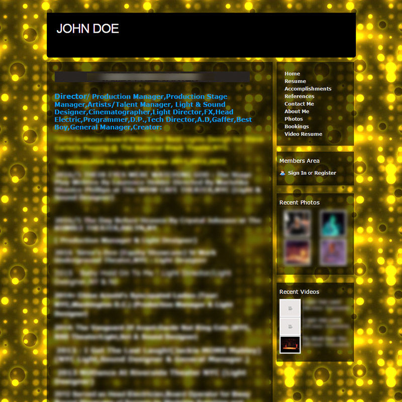
Lights! Shiny things! Dots! Sparkly! Where are my sunglasses?
This design just screams "GO ELSEWHERE". I had to tone my blur way down, because things are barely readable as it is. The horrible background is clashing with everything. The only images are tiny thumbnails in the sidebar. Just what I'd expect from webs.